Art is arranging elements in a way that appeals to the senses or emotions, so therefore I think anything can be art and everything is art because everything appeals to our senses, both good and bad.
Roxelle Tran
Sunday, February 28, 2010
DIsappointing Final Friday - Emily Ritter
I was very disappointed with this month's Final Friday. I didn't see anything new and exciting, just the same old stuff.
I did however like the sculptures at the Fiber Studio. I forget the artists name, but they were fabulous. I always enjoy sculptures of the human body.
I have noticed a lot lately that I have been becoming more and more abstract with my work. I have no idea, but it is happening. Here is an artist I found, who is starting to grow on me, that does abstract work and the human figure (which I love).
www.antonygormley.com/
Saturday, February 27, 2010
Satoshi Kon

Satoshi Kon has become one of my favorite animators. He has created movies such as "Paprika" and "Tokyo Godfathers" and also a series called "Paranoid Agent". I'm fascinated with Kon's work because of the creativity that he has used for his projects. Although they seem to be just cartoons, they are quite not the average cartoon. These stories and the characters are filled with mystery and surprises; they keep the viewer's attention and have the viewer wondering "what's going to happen next?". I have to admit, I am one of those viewers.
Carlos Aquilino

At trying to find a work of art for our next project, I found an artist called Carlos Aquilino. Aquilino's work is mainly based on life's subjects. Aquilino's artwork is conform of surreal and geometrical compositions. What makes his art interesting is that he creates paintings or sculptures according events, and emotions that he perceives. Well if any of you are interesting on seeing Alquilino's artwork feel free to check more information about him at the following sites.
http://www.kunstaspekte.de/carlos-aquilino/
http://www.artfairsinternational.com/?p=824
☺Victor Villanueva ☻
Art for Someone
About a week before, USA Network startsthe campaign called "Character Approved: 2010 Honorees". That intruduces the people who does significant culture work in different fields, for music, art, fashion, film, and so on. And today, I saw the short program that forcused on the Designer,Yves Behar. Most of his works are very simple, but have distinctive and useful shape for user. The products I am most impressive in all of his designs is the $100 computer. He designs this for the kids. The design, using plastic matelial for exterior and light green and white colors makes this a toy computer, butI thinnk that appropriate design for kids. Thinking about the costermars, audiences, or viewers, that is we are doing in previous and this assignment in the class. So, I chose to write about him for this week.

http://www.usanetwork.com/characterapproved/index.html
Have a good weekend, everyone!!!!
Ichie Kawasumi

http://www.usanetwork.com/characterapproved/index.html
Have a good weekend, everyone!!!!
Ichie Kawasumi
The Power of LIne
I just spent the hour studying Lasansky's Nazi Drawings, and despite feeling a little raw from such brutal images, I am blown away by the power of the simple lines that the artist used to convey such horrendously cruel atrocities. Seeing these drawings in person must be overwhelming because most of them are so big, and imagining how the artist must have felt while making this art reminds me of Mel Chin's recent comments about having to be compelled to create his art. Lasansky's spiral mark making reminds me of piles of unfriendly and cruel barbed wire, perfect for depicting the clothing of both executioner and victim. If anyone else is interested in anti-Nazi art, check out the Berlin Dada artists of the twenties and thirties. Lasanksy's drawings remind me of George Grosz's paintings and John Hartfield's collages.
Also, I really enjoyed seeing everyone's work at Critique this week. It is clear that everyone has very interesting ideas and lots of talent. All the different approaches to the same assignment were marvelous, and I am please to be included in such a great group of artists. ann
Also, I really enjoyed seeing everyone's work at Critique this week. It is clear that everyone has very interesting ideas and lots of talent. All the different approaches to the same assignment were marvelous, and I am please to be included in such a great group of artists. ann
lasansky, hemingway, and evening cereal

Retrato de Emilia.
writers are artists too
Recently I have been on a Hemingway binge. Reading all of his short stories and then the Garden of Eden, and now I'm working through For Whom the Bell Tolls.
If any of you fellow bloggers haven't gotten a chance to sit down and read a Hemingway novel then you're missing out.
-benjamin
Slow Go...
Ya, I spent all day yesterday working on my "stencils" for my poster project. During last class I had created the image on mylar using a black marker, but when I got home and held it up to the light I could see lots of areas where light could be seen through...not direct light, but still light. That got me worried that it might not work, so I started to try other ways of drawing on mylar. I went to HL looking for litho crayons, but couldn't find any, instead I found marker crayons, which seemed to work the best, but once you got the end dulled down it was going to be impossible to do sharp edges or corners...I could of course sharpen them, but then I'd be using up a lot of the crayon and I think I'd need a lot of them to complete the project and it just didn't seem logical. So I then tried to paint the image onto the mylar with acrylic...it seemed to work to, but again when I held it up to the light I could see too many places where light was shining through. So with half the day a wash I ended up starting to create stencils from black paper that I KNEW wouldn't let light through. So the goal now is to continue to use this technique and try to get caught back up to where I wanted to be and to show Monika the mylar drawings I did and see if she too thinks that they are letting too much light through, or it's just me. I decided for now I better be safer than sorrier. (Is that even a word?) --__Later, Jason R.__--
Friday, February 26, 2010
Sports Art
I found a great Website for art, especially if you like Celebrities, Music, Sports and even very original pieces. One bad thing I found was the lack of Artists it features. The Sports section of this website really struck my interest. These pieces range from things like Streetball, all the way to pictures of athletes like Joe Montana and Michael Jordan. http://www.artofthestars/gallery/sports
Corey Rausch
Corey Rausch
When we were asked in class to think of artists we didn't like for our most recent project in intro to printmaking I had such a hard time thinking of some. If at first I thought I didn't care for a piece of art I would look at it longer or look at other works by that same artist and decide that it had enough valid qualities that maybe I did like it or at least felt neutral and could not go so far as to actually say I don't like it. One artist I do dig that I had not really checked out in years is H.R. Giger. He has influenced what people think of when they imagine aliens and it's cool that what one guys imagination creates can become what thousands of people associate with what an alien would look like. I'm going to make a point to check out the Necronomican book again soon.
Brenna Russell
Brenna Russell
Gordon Parks
If you havn't seen the Gordon Parks exibit yet, I encourage you to go view it for a while. His work and the story behind him are very inspiring; there is about a month and a half left of it, so go look at it!
Brooke Gluszek
Brooke Gluszek
Monday, February 22, 2010
Rob Zombie
Apparently Rob Zombie is also an artist, apart from being a musician and a director of terrible movies. Heh.
Or maybe it's someone else who does art for Rob Zombie. And if I'm wrong, then it's a terrible shame, and the entire economy of the world shall collapse into ruin.
Either way, I love it. There's so much inspiration from hot rod art/culture (which I adore), Americana, rock n' roll/heavy metal culture, horror movies, and comic books. All of which are things I've grown up with. Ah, my wasted childhood. I appreciate the way this art style allows your eyes to immediately grasp the detail in a drawing or a situation without having to spend an indecent amount of time studying it. Maybe that's just laziness on my part. The gross-out factor is definitely big in this style, too. Some dudes' eye popping out in a gush of green ooze is just...yummy.
http://l_e_a0.tripod.com/id41.htm
Anywho, there are some examples. EMBRACE IT.
-Salem
Sunday, February 21, 2010
New Art Supplies!-Katie Brown
I just wanted to share my love of art supplies with everyone since I've been working on the assigned sketches all day! I just bought a nice set of copic markers and this is the first major piece I've used them on and i have to say they are amazing!
They are expensive and they are hard to find...but once you have them you will never go back. Unlike prismacolor markers they have a superbrush tip which essential acts like a paintbrush. Another key difference between the two brands is the way the ink is distributed to the tips. In prismacolor they use a capillary feed which is kind of like a sponge that sucks ink to the tips...so the smaller tip dries out quicker and doesn't always have a steady flow.
Copic sketch markers are also refillable-a $10 ink refill will fill the marker about five times quickly offsetting the costs of the initial marker in the long run-and there are a wide number of different tips that are fully interchangeable and replaceable.
Prismacolor markers are not refillable and once the nubs wear down, you're stuck with an uneven color lay down. Prismacolor colored pencils however are very nice quality, color intensity and blend well.
Copic also makes more colors than prismacolor-333 in all and has a custom made black inking set with specialized ink that won't smear when copic markers are used over them.
Overall, my money is on the copic markers for anyone looking for a serious investment in art supplies is. Other brands like prismacolor may be cheaper per marker initially-copics are 6.50 in store and prismacolors are 4.50-but in the long run copics pay for themselves and can be found online for much cheaper- around 3.50 a piece.
I just made my purchase from https://www.carpediemstore.com/listCategoriesAndProducts.asp?idCategory=22 and am VERY VERY VERY HAPPY with them and the service provided. This is the cheapest I have found anywhere online and though they take a few days to ship from California, its well worth the wait.
Pat Perry Time-lapse Painting
Pat Perry found a very unique way of documenting his artwork, and creating another form of art through videotaping his progress on a painting. I like the combination of mediums in his paintings, acrylic and ink. This is the link to one of his time-lapse drawings:
http://www.stumbleupon.com/su/5kOisE/www.patperry.net/blog%253Fp%253D441
-Jose Alvarado
SUPERART

I've been living in Wichita for about two years now and I've created almost no art. My dad does art however. Every day I open the door and he has a cigarette in his mouth, painting, or drawing, or doodling up his next idea. He is horrible at keeping up with his website, but it still has quite a bit of his stuff up.
check out superartists.net
Kathe Kollwitz is an amazing artist! She drew some pretty serious subject matter like people, particularly women and children, in abject poverty, sick, or dying. These were not polite, feminine little colorful paintings that went well with one's decor, but rather, they were stark and mostly black and white drawings. Her subjects' features were really carved out on her paper. I think of her as the German version of Toolouse Lautrec, but the Paris academy would have had a real issue with her, I suppose.
I liked Lee's comments about music and art, and wondered what everyone likes to listen to when they have music on and are making art. I like almost everything but really like Mozart or Bach when I need help with ideas. I've been listening a lot lately to Al Green, Nirvana and anything funk, like Parliament and the Ohio Players. Hope everyone has a safe Sunday. The frozen rain is really pinging off the windows. ann
I liked Lee's comments about music and art, and wondered what everyone likes to listen to when they have music on and are making art. I like almost everything but really like Mozart or Bach when I need help with ideas. I've been listening a lot lately to Al Green, Nirvana and anything funk, like Parliament and the Ohio Players. Hope everyone has a safe Sunday. The frozen rain is really pinging off the windows. ann
Exploring Ideas of Race in Art
Throughout the week, I have been confronted with ideas of race. Whether it has been directly or indirectly; from issues with President Obama and the public's view, or questions about my past relating to race--it seems to always come up. It is something that I don't really like to focus on simply because I feel that race does not, or should not matter. But to some, race is a very important part of their lives. For some, it is important to understand where they come from or to understand certain ideas or history.
While watching an episode of Art 21, I was introduced to Michael Ray Charles. I was at first drawn to his work because of the way he portrays things in a sort of consumerist manner, that is to say that his work looks as if it is a poster advertising goods. I like this style in art. As the episode progressed, the artist began to explain how through his work, he was exploring ideas of his history and the view of black people throughout American history. One thing that I found interesting when he declared racial issues as being an issue that is not only that of blacks, but whites also. This can be seen in works where Charles explores white-face, as in the painting of Uncle Sam as a black man in white-face. Probably the most interesting thing I found in the segment was that Charles embraced the portrayals of blacks throughout time, including those of 'big lips' and 'darkies'.
I was fascinated by the work of Michael Ray Charles because it reminds me a lot of Kara Walker's work. Not so much in style, but in the ideas behind the work, how their art is more a delve into their past trying to make sense of things related to race.
If you are interested in Charles or Walker, here are a couple of links.
http://www.pbs.org/art21/series/seasonone/consumption.html
http://learn.walkerart.org/karawalker
Also, if you have Netflix, Art 21 is available for instant viewing or by DVD.
-Aaron Rivera
Saturday, February 20, 2010
What Is Printmaking Today?

I found information about a festival about "Philagrafika." Philagrafika will include "etchings and woodcuts, vinyl graphics, comic books, videos and complicated, conceptually driven projects intended to raise social consciousness." The festival will take place in Philadelphia this year. If you are interested on knowing more about th
 is kind of exibitions, the information can be found at the following sites.
http://www.nytimes.com/2010/02/05/arts/design/05philagrafika.html?pagewanted=all
http://www.philagrafika2010.org/
--- Victor Villanueva
Music and Art
I think one of the biggest inspirations to art is music, well, at least for me that is. Music seems to make my mind wonder and think and helps create images in my mind that I feel I have to take to pencil and paper. But I know for a fact that artists have used music for new ideas; to help them with creating works of art. In my opinion, music contributes to artworks everywhere to a great amount and because I've realized that, I appreciate music in a different sense now.
Lee Jones
Cartoonist
Hello, everyone!
This week, I will introduce my favorite catoonist. Her name is Natsume Ono. She loves to draw foriegn countries people. So, most her comics depicts those people's ordinally life. The recent her comic is about the police officers in New York. I like those her stories, but actually most of you guys aren't gonna like her story. Anyway, there is also another reason why I like her. It's her illust!!! It's not realistic but she never forget the feature of difference of male, femalre, young old, and so on. Also, the thick outlines, simple design, and coloring which doesn't focus on shading illusts are like printmaking. I hope I print the illust like hers one day.
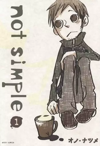
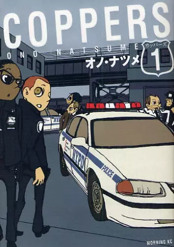
This is her official home page. All of contents are written by.....I think Italian.(because she likes Italy so much)
http://79orsi.web.fc2.com/
http://79orsi.web.fc2.com/
Ichie Kawasumi
Soooo some inspiration from last class when we had our critique, Monika mentioned German artist -Kathe Kollwitz and after some google research, I found some pretty awesome images. I thought I would share with you all my favorites.
http://www.jimandellen.org/KatheKollwitzWomanwithherDeadChild.jpg
http://www.linesandcolors.com/images/2006-06/kollwitz_350.jpg
http://www.prints.co.nz/Merchant2/graphics/00000001/189DR_Mother_and_Child_Kollwitz_Kathe.jpg
Some of these are super sad, like the first one which you can tell what it is by the name of the link, the second one's face looks serious or worried and the last you can see the pure joy that a mother and child experience through their unique bond.
Emotion is portrayed well through her work I've seen so far and I like what I'm seeing.
Lata.
Jenny Gurhke
http://ohhitsjustjenny.blogspot.com/
So my major is graphic design and things seems to be going alright with that so far. I have only been taking these classes for not even two whole semesters, but since I started taking print making, it has been pretty enjoyable for me. I LOVE drawing more than designing or anything I've tried thus far, and I get to do that in this class. Though my last project turned out to be a total bust, I plan to try harder to make the next ones work better. Who knows, maybe a major switch? I guess I'll just see where the future takes me :) Jenny Guhrke -http://ohhitsjustjenny.blogspot.com/
I looked at some prints from the artists suggested for refrences in the printmaking etching assignment. I enjoyed the prints by Michael Barns. The "foggy" look was nice in some of the works it was calming for me to look at but in others it made the prints seem dark and disturbing. All of his prints and drawings I looked at were interesting.
Brenna Russell
Brenna Russell
Friday, February 19, 2010
The Starlight Calliope
A few years back I got into this comic book, The Starlight Calliope, by Andrew Hussie. Time passed, and I completely forgot about it, among a lot of other really good works by the dude. So, I was just goofing around on the internet, and it popped into my head for some reason.
So it turns out I can actually buy the comic book now. Sweet. I'm totally gonna do that.
They offer the first 50 pages of the comic for free online, so I suggest you take a look at it. The artwork is pretty damned spectacular. Andrew Hussie has that insane way of making his characters embody a very organic and natural feel, while still maintaining a great cartoony atmosphere. I guess it's the same way that John K. makes Ren & Stimpy look. Except I'd say John K. exaggerates his characters far, far more.
Hussie's style itself is almost always presented in some strange alternate universe, where technology has advanced to the point of...well, just think of Blade Runner. Only happier. And if you haven't seen Blade Runner, then I am ashamed to know you.
Aside from my disappointment with you (you dirty, filthy heathen), the story itself is actually pretty interesting, even if it is highly disturbing. And hilarious (or at least I think it is). I won't spoil it for you, because, well, it happens within the first few pages anyway.
http://www.teamspecialolympics.com/whistlessite/preview.php?page=000.gif
There's the site. Check it out.
-Salem
Sculpture - Emily Ritter
Sculpture is a new found love of mine. I am presently in a casting class, and soon we will be doing miniature bronze pieces. In this process, we will be using wax. I love the way wax sculptures look. They look as if they will come to life. So smooth and detailed. I went searching for other images of wax sculptures, and here is what I found.
http://steveworthingtonart.blogspot.com/2009/03/next-steps-in-bringing-my-tiny-elephant.html
Thursday, February 18, 2010
Beautiful Korean Manhwa
I think there is some misconceptions about comic book art at least between those who are casual art consumers. I can't count the number of times I've heard knock on comic books and manga as not being art and just childish entertainment material.
Well, whenever I hear that type of talk I always wish I could pull out The Bride of the Water God by Yun Mi-kyung which has some of the most beautiful Korean art I've ever seen. The mix of traditional art and modern use of digital screen-tones and affects bring a whole new ambiance.
 https://blogger.googleusercontent.com/img/b/R29vZ2xl/AVvXsEjjIsehias_juU0YxRbrEaHBmWJogEWUuwf8c9gYjyrgldjUq61OH3qzbUEPvnlxgJ38d4UeI0ZSi1i2Nj8y5rDdrVQK8oCgX-fz2SMPnJ7nXVCPFEYJ3z8-1gXCEMjne5GLi4Z_pkkAUfo/s400/watergod.JPG
There is a delicate balance between the original watercolor art and the print-this is a full color illustration in the third volume I believe. There are of course many more amazing artists creating manga and comic books but Yun Mi-Kyung is one of my favorites.
Well, whenever I hear that type of talk I always wish I could pull out The Bride of the Water God by Yun Mi-kyung which has some of the most beautiful Korean art I've ever seen. The mix of traditional art and modern use of digital screen-tones and affects bring a whole new ambiance.
https://blogger.googleusercontent.com/img/b/R29vZ2xl/AVvXsEjjIsehias_juU0YxRbrEaHBmWJogEWUuwf8c9gYjyrgldjUq61OH3qzbUEPvnlxgJ38d4UeI0ZSi1i2Nj8y5rDdrVQK8oCgX-fz2SMPnJ7nXVCPFEYJ3z8-1gXCEMjne5GLi4Z_pkkAUfo/s400/watergod.JPG
There is a delicate balance between the original watercolor art and the print-this is a full color illustration in the third volume I believe. There are of course many more amazing artists creating manga and comic books but Yun Mi-Kyung is one of my favorites.
Wednesday, February 17, 2010
Printmaking
I've been searching the net, researching printmaking and have come across a couple things I'd like to share. First is a site that shows you how to build your own screen press and also sells a kit with everything to do so if anyone is so inclined to have their very own (www.printingplans.com).
I think a lot about my future as an artist and although it would be nice to not think about how you'll actually create works in the future without the use of school equipment; it's something I consider often. I like to look at everything from cost of equipment to space required to what the limitations of any said technique might be. (P.S. Don't look up the price of a printing press) I like to think of worst case scenario of having to create all my work from home. Although I won't choose an art path based solely on this; it's something that must be considered.
I also came across a great interview with a printmaker named Ken Kerslake (www.artschools.com/interviews/ken-kerslake/) He has a lot of insightful things to say about his career as a printmaker and the world of art. It's not very long and I think would be beneficial to everyone in one way or another; so give it a quick read.
I think what is comes down to is what you really what to be doing with your life. The moment you die and the last few second you have to look back on your life; will you be proud of your accomplishment or will your life seem like a waste of time. You've got to find what makes you happy...you're the only one that can. --__Later, Jason R.__--
Monday, February 15, 2010
A Glimpse - Emily Ritter
Recently I have gotten a glimpse into the art world, or at least part of it. This month, I have my work up at the Vagabond, which is also my place of employment. I was excited to have my work up for a month at the place I work, because I would be able to hear the public's opinion. The good and the bad. In my mind, it would be interesting to basically have a type of critique outside of the art department. That is not what I have received. From the Vagabond patrons, I have heard nothing but good things. "Oh, that is really cool." "They all look so different. I like it." And so on with the vague, biased compliments. Don't get me wrong, I am really happy with the reaction I have gotten. It makes me feel good that the public actually likes my work. I have actually sold quite a few, and have set a new record for the Vagabond (which usually has horrible "art" up on the walls), but I wonder if they are just saying these nice things because they see me every time they come in. That they are afraid to hurt my feelings by telling me how they feel. Or maybe it is that they do not know how to articulate what they see and how they see it.
The other side of the art world that I wish I wouldn't have to deal with, but will have to deal with more and more, are the people that take the microscopic piece of authority that they have to a whole new level. This might just be an isolated case, but I highly doubt that. I have been given a hard time for "not pricing my work high enough" or "not framing things correctly" or the best one so far "not replacing a space" because I sold a piece to a guy that wanted to give it as a valentine's day present. I keep reminding myself "it is the Vagabond, not the Met." I am amazed at how people get all worked up over a piece having a weighed bottom, or being of a reasonable price. Most all of my pieces are between 35 and 50 bucks. That is why they are selling, because people can afford them. Oh well, I better get use to this pointless bickering and misuse of power. Maybe I should shoot the prices up to 1,000 dollars and be an unsuccessful artist. Get a big head. Become full of myself just like the people that are in charge. Honestly though, I rather not be that pathetic and just do what I do, stick to what I know, and stand up for myself.
This was partly me venting, but it has to do with art, so there ya go.
Sunday, February 14, 2010
Katsuhiro Otomo
So, I'm cutting this a bit late (I lost track of time, and I'm a horrible slacker. Sue me), but I'm posting anyway.
Katsuhiro Otomo is this pretty rad manga dude. I don't read a lot of manga (I think most of them are silly and...uh, I guess just silly), but Otomo is one that got me hooked. His most popular work is undoubtedly AKIRA, which was made into a movie some 20 years ago. So if you haven't seen that, I recommend it. But you'll have to watch it several times, or read an online summary to understand everything that's going on. It's deep. Or maybe it's just incredibly stupid, but it seems deep. Either way, the animation is incredible. And violent, too! Even if you hate the story and the characters, you have to admit the art is astounding. It's so fluid and alive, unlike much anime which usually animates only one or two actions in a scene.
http://www.bbakira.co.uk/stills/stills2.htm
So here's a fan website with oodles of images and such. A few videos, too, so you can watch a trailer or something, if you desire.
-Salem
Reply to "Are video games art?"
I also do think that video games are a form of art. Sometimes I am criticized for playing games so much as many people think that it is a waste of time. But for me, when I become engaged in a game, I think of it more than a form of entertainment and think of it more like a new world of things I can not access. It becomes a fantastic adventure I can take part in.
These images often influence my art. For example, I am currently playing the Dante's Inferno game on the Xbox 360. The game was based on the epic poem. I find it a great source of ideas as the game's artists did create each character based on the mythology of each creature.
I am currently working on a set of nesting boxes in my hand building class based on the idea of circles of hell. Each box opens to a smaller box, each one dealing with an idea or part of hell as viewed form different cultures. I have included any ideas from the Dante's Inferno poem and game.
If you are interested in the game and its art, check out the website for concept art.
http://www.dantesinferno.com
-Aaron Rivera
Saturday, February 13, 2010
Claude Monet
I didn't think I'd be too interested in Fine Art works, but once I actually take a look, I realize that these artists are quite original. I really only have two favorites; Salvador Dali is one of them, but my most favorite is Claude Monet. I'm not too sure on what I liked about his art work, I think it was how he used various colors to create scenes of landscapes or portraits and they would realistic in a sense at the same time. He painted his art work, but I tried copying his style by using pastel when I was in high school. The first project came out pretty good; the second however........not as successful.
Lee Jones
Are video games art?
There's a debate going on about video games and art. Game creators argue that according to the deffinition of art games can be categorize as "art." But, the problem is that many people do not see any art in video games, because they are just a form of entertainment. In my opinion, games are a form of art. They make a statement ,and basically they make you think, so I would say that games can be a form of art.
Well if you are interested about this controversial issue, you can get more information at the following sites.
http://gamepolitics.livejournal.com/357698.html
http://gamesareevil.com/2009/04/video-games-as-art-an-in-depth-analysis/
--Victor Villanueva--
Well if you are interested about this controversial issue, you can get more information at the following sites.
http://gamepolitics.livejournal.com/357698.html
http://gamesareevil.com/2009/04/video-games-as-art-an-in-depth-analysis/
--Victor Villanueva--
raising your hand
About a year ago I read a little over half of "The Secret Life Of Salvador Dali". It was the most obscure half of a book I'd ever read. Don't get me wrong, it was very enjoyable. I was intrigued by how he described some of his art. If you haven't read it yet, you should.
-benjamin palmour

 the art to the right is called "Small Dreams of Success"

-benjamin palmour

 the art to the right is called "Small Dreams of Success"
So i have been reading this magazine lately called Juktapoz. It is an art and culture magazine. I find it really interesting to read. It covers alot of different mediums of art and artists all over the world. and it has fantastic pictures to look at. If you don't already know about this magazine, then you must go to a book store and look through one. Cuz it is beautiful!
-Susie McHugh
-Susie McHugh
Friday, February 12, 2010
Inspiration
We all need a little inspiration now and then and I think music can be a great way to look at the world with new eyes (or the world in your own head...whatever). So for this week I'm introducing three web sites dedicated to music that I recently stumbled upon in an magazine (which was in no way associated with art; so might be new to you). The reason why I'm listing these sites is because I love to find NEW music to listen to and not all the same boring crap the radio plays over and over and over...nobody has taste anymore.
First: thesixtyone.com
Second: Pandora.com
Third: Musicovery.com
Just in case: live365.com
Check these sites out, if you haven't already, for a chance to find something you've never heard before or would be less likely to find yourself. Hope one of these sites inspire those creative juices!
-_Later, Jason R._-
Karen Kunc
I've just looked at some of Karen Kunc's prints at various web sites. The first striking and consistent feature I see in them is the way her images have a cloth or fiber arts-like look. Some prints contain strong interwoven linear elements in the composition. And I believe that all of
her prints could translate easily into tapestry weaving or sewing/upholstery fabric designs. In fact, many of her prints remind me of mid- 20th c. cloth. I am also reminded, by some of the quirky arrangements of loose rectangular shapes, of animation used in some 1950s-60s TV show & motion picture openers. Kunc has created quite an array of textures. I wonder at the effective use of color, value, shape and line she used to achieve movement & dimension, spacial & textural effects in her wood block prints.
I wonder about her process, no doubt possessing the same vitality of the prints themselves.
There appears to be solid advance planning involved. I am curious about how closely she sticks to an original and detailed plan. I wonder how much room she gives herself to be spontaneous during some steps. It seems to me that a bit or more of tweaking must take place throughout Kunc's process. Several pieces I looked at involved wood block printing combined with etching or watercolor painting. Ah! Those mysterious and beautiful layers!
Margaret Raymond
Thursday, February 11, 2010
I looked at the prints by Karen Kunc. The design and the color were really nice, I liked the way the color was blended. I'm not super familiar with printmaking and the work of those who do it but Karen Kunce's work seemed unique compared to the print work I have seen. I also looked at the work by Sean Starwars. His addition of booze, cigarettes and tattoos to his works is appealing to me. The Tom Huck prints I looked at were really visually interesting. There is a lot of stuff going on in his prints and they seem to tell stories as one explores the print. I would like to look at one of his prints in full size, I guess they are pretty big, a person could spend a few minuites looking at one of his prints and keep finding new things within it.
Brenna Russell Intro to Printmaking
Brenna Russell Intro to Printmaking
Monday, February 8, 2010
Digital Art-Katie Brown
I was just wondering what this class's opinion on digital art is. While I would definitely classify it as "art" I know there is a sector of the traditional art community that don't hold it in the same category.
I'm mainly curious because I've been using Corel Painter 11 for our most recent project to create perfect symmetry and appropriate some other elements into my ideas. I also love digital art, there is just something other-worldly about some of the affects that can be created with a full tool kit of airbrushes, conte, oil, watercolor, acrylics, photo effects, lighting, texture and the ability to create quickly and accurately large, beautiful works.
I find it exhilarating to be able to grab my tablet and design something good, then using free transform tools and multiple layers and manipulations make it great...or well better at least. This printmaking class is certainly pushing me to become a better artist every single day and explore new ideas and ways of creating.
Sunday, February 7, 2010
Sketchbooks - Emily Ritter
Side note: This month my art will be up at the Vagabond in Delano. It will be up the rest of February. Go check it out!
One thing I have always enjoyed is looking at other artists sktechbooks. It is like a glimpse into their mind. I think that everyone, not just artists, should have a sketchbook. I know that I have more than I know what to do with, and always have one on me just in case of sudden inspiration. I constantly search the web for glimpses into others minds. I found this website www.bahance.net that has some pretty good artist profiles. Check it out and get inspired.
notcot.org is so rich
Squeaking in just before deadline, I have spent the last 90 minutes browsing notcot.org and this blog. Undaunted though a bit overwhelmed at the material available at notcot, I went to illustration category and found some pertinent art. Two artists I looked at are Hiroshi Tanabe and Noah Scalin.
Tanabe's illustrations are described as resembling old wood cuts. The value contrasting color images pop from black background. He effectively creates dimension, pattern and texture using thick contour lines and repeated cross contour and hatched fine lines. These images are rich with implied line as well. Check out #25721 at notcot.org.
Scalin created a Skull-a-day project for himself before opening it up to reader contributions & has since collaborated with at least one of them. He began by producing a skull-a-day in various media for a year. I found what I was looking for in #s 49 and 55. 49. Rat Skull Linocut Print uses bold positive and negative shapes that fit the theme very well. The human skull face and rat skull are light with deep black shadow delineating features while the left side of the composition are very black. There is some good use of cross contour to add dimension.
55. Scratchboard Skull is indeed a scratchboard piece that has visual qualities in common with
prints. The black background perfectly sets off the skull composed of white lines. Cross contour lines produce effective shading as well as interesting patterns. Scratchboard could be a good way to explore an idea before making it into a print.
Margaret Raymond
Cartoon Art Work
I'm confused on whether cartoons can be considered art or not and the reason is because of school. I hear that some people who are part of the staff don't consider it art, but why not? Are cartoons not something we create by drawing them or making them on computer just like any other art piece? Can they not be considered abstract sometimes? I don't understand but whether they are or are not considered art work, it is the type of art work that I do on a regular basis. I want to be an illustrator or a cartoonist, although I'm still workin on creating my own style. If there is a way, I would like to create cartoons as works of art in some kind of way some day. I'm still figuring things out, but with practice I'm sure I'll get it.
- Lee Jones
- Lee Jones
Saturday, February 6, 2010
scrapbooking
So I'm a huge scrapbooker and love all the different ways you can set up a page. From the different papers you can buy to the techniques you can do to the paper, and then adding on embellishments, you can turn any page into describing you and your photo perfectly. Looking at scrapbook page layouts really can inspire you to design something cool. While browsing a scrapbook website to get some ideas for some of my pages I thought it would be cool to share some of other peoples layouts with you all to show you how creative you can get with a scrapbook, and who knows...maybe they will inspire you for your next project...whatever it maybe!
www.scrapbook.com/gallery/?type=layout&start=20&c=63
Brooke Gluszek
www.scrapbook.com/gallery/?type=layout&start=20&c=63
Brooke Gluszek
Gahan Wilson
Gahan Wilson is primarily a cartoonist. The subject matter is, more often than not, incredibly morbid humor. Nuclear mutants, serial killers, cannibals. You get the idea. His content is just full up with such a diseased comedy, you can't help but laugh.
But, more to the point, I absolutely love the way he draws his people. They all look like some sort of weird troglodytes that came from under the ground, expressing a pretty good idea of what people really look like. Other characters are often ghoulish, freakish, or fiendish, with crooked smiles and jagged teeth, or wobbling eyes. His shading style really does it for me, though. He usually shades with lines in one direction on any given piece, never the other way. This, to me, presents his art with a unique expression of, I guess I'd say 'reliability'. It helps direct your eye along the page, instead of having the shading lines crash into one another, they all sweep along the cartoon in one direction to keep it steady.
http://www.gahanwilson.com/collection11.htm
So there's the 'official' website, with two or three cartoons of his. I wish there were more. They really are good for a few laughs.
-Salem
Pedro Friedeberg
I was watching a Mexican channel last week, and during the news there was a report about a Mexican artist called "Pedro Friedeberg." The report was about Friedeberg's art. He was the creator of the Handchair, and many other "weird" pieces of art. If you are interested on looking at his gallery, and in knowing more information about him, you can check them at the following site.
http://www.pedrofriedeberg.com/
-Victor Villanueva
http://www.pedrofriedeberg.com/
-Victor Villanueva
duchamp, mArcel dUchamp
Duchamp was an innovative Frenchman. He presented readymades. The most famous one is probably "Fountain". Which was a urinal signed R. Mutt.
The readymades were common manufactured items that he barely, if at all, modified.
In this way Duchamp was able to ask the question in the wider sense,"What is art?"
check his art out at http://www.duchamp.org/index.html
-benjamin palmour

The readymades were common manufactured items that he barely, if at all, modified.
In this way Duchamp was able to ask the question in the wider sense,"What is art?"
check his art out at http://www.duchamp.org/index.html
-benjamin palmour
Shape Shifters: An Exploration of Paintings & Prints
by
Kat Eastman,
Joel Escarpita,
Abram Howell
& Megan St.Clair

Come visit our show! It will be up at ShiftSpace until the 18th
Gallery Hours are Thursday and Friday 4-7pm & Saturday 11am-2pm
Kat
Kat Eastman,
Joel Escarpita,
Abram Howell
& Megan St.Clair

Come visit our show! It will be up at ShiftSpace until the 18th
Gallery Hours are Thursday and Friday 4-7pm & Saturday 11am-2pm
Kat
Amazingly Small World
Hi- I was talking in class Wed. about how one of my best friends for over 30 years is the grand nephew of art critic Clement Greenberg. Having known Bob so long, I never knew this little factoid until this past Monday when he called. Ok, so, my daughter Ellie and husband, James, stay with Bob on Thursday in Dallas while Ellie was visiting a little college as a perspective student. She is really into ceramics and took a bowl she made to Bob and his wife as a thankyou gift. It turns out Bob's wife, Elise, throws pots at her neighbor's house across the street. Elise takes Ellie over to her neighbor's ceramic studio to meet the owner, Louise Rosenfield. It turns out that Louise is a BIG patron of ceramic artists and everyyear sponsers a gallery showing for them where she picks up the gallery's cut so that the artists get the entire profit of their sale. When she hears that Ellie is from Wichita, Louise asks her if she's ever heard of Ted Adler. Ellie tells her that her nut mother is an art student at WSU. Then, Louise takes her inside her house to show her the pieces she owns made by Ted. He even stayed at their house once. So, check out Ted Adler's artwork/website. One more little snippet of info. Bob tells me Vincent Van Gogh's "The Potato Eaters" was his first painting in color. It is a small world. ann
Japanese Printmaking
Did Monika assign the topic of this week? I can't find(-_-;) Anyway, I introduce you the famous japanese printmaking artist, Hokusai Katsushika. I like his "Fugaku-Sanjurokkei". Fugaku means the art which depict the Mt.Fuji, and Sanjurokkei means thirty-six landscapes. This is the seirous of printmakings which depict the Mt. Fuji(the highest mountain in Japan) from different 36 sites.

When the first time I saw this, I never thought this is the printmaking. He also did lots of amazing printmaking. This web page show other his works.
http://www.katsushikahokusai.org/

When the first time I saw this, I never thought this is the printmaking. He also did lots of amazing printmaking. This web page show other his works.
http://www.katsushikahokusai.org/
Wednesday, February 3, 2010
Great Job Everyone!!!
Let me start by saying the first critic was great. Everyone did an awesome job and the variety of work was intriguing.
When I was doing some independent research on an artist I was interested in I came across a site called Lulu (http://www.lulu.com/index.php). It seems to be a site directed towards people who are interested in self publishing their works. There's a section on art as well, although I don't necessarily think this would be the best site to use to sell your work (if you're interested in that). Regardless I've included it because it's an overall good site to check out that could possible be valuable to some of us in the future.
I'm always interested in ways in which you can sell art as well as getting your name out there. That's why I always keep an eye out for what looks like a decent site to display works of art and well as trying to sell them and create a following. (Although I can't say I've used any of these sites due to the fact I'm soul searching for my preferred medium) Anyway one of these sites is ArtFire (http://www.artfire.com/). It's really amazing what you can find on some of these online art sites. It's also great that you can narrow down a search to specifically what your interested in and see works created in that medium. I've done this many times to see what the possibilities for a specific medium might be.
Here is an example of an one of these many artist's prints. It's a Woodcut titled: First Frost.

The complexity of this piece is intriguing. These sites are great to explore for inspiration as well as buying art for prices college students can afford. Hope you enjoyed! --__Later, Jason R.__--
Subscribe to:
Posts (Atom)